By cuterose
Hands-on: Sigma’s iD.TRI & iD.FREE Multisport GPS Watches
I’ve always been a bit impressed by Sigma. Here’s a company that is mostly unknown outside of Europe (or even Germany), yet they tend to put out high-quality products that compete technically with those from the bigger-name American and European brands. Now, I say ‘technically’, because in general Sigma nails the functionality aspects. After all, their SIGMA ROX 12 GPS that came out last summer is ahead of what popular bike computer maker Wahoo Fitness offers on any of their head units from a functionality standpoint, and it’s not terribly far behind Garmin in certain areas either. The challenge for Sigma instead has always been the inverse problem of ‘Form over function’, more of a ‘Function but not form’ sorta issue.
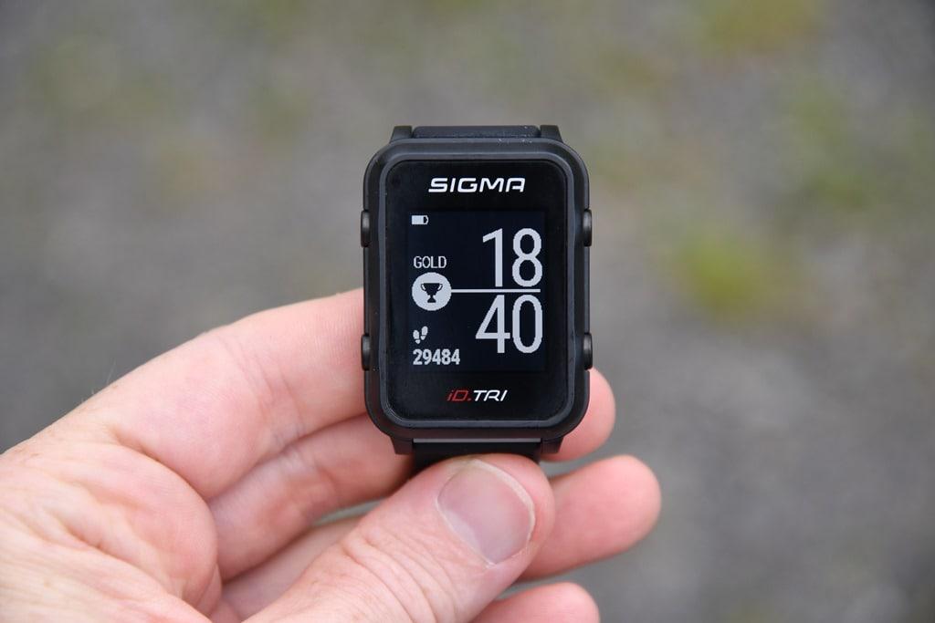
But first, an explainer. The company has two products here – the iD.FREE (169EUR) & iD.TRI (179EUR) I’m going to abbreviate them to just Tri and Free, simply so I can type faster. Both units include a bike mount in them, which is reasonably impressive – and both units are identical in hardware specs. The 10EUR difference simply adds structured workout, competitions, and multisport mode to the other model. I’m mostly going to use the Tri variant in this post.
However, what’s impressive is the list of pretty advanced features for a sub-$300 watch, let alone at sub-$200 watch. Here, a quick overview:
– GPS recording with up to 12hrs run-time (8hrs in 1-second recording)– 7-Day always-on mode battery life– Optical heart rate sensor (via Valencell)– ANT+ & Bluetooth Smart Sensor support (HR/Power/Cadence/Speed)– Barometric altimeter (no new Suunto/Garmin/Polar triathlon watch below like $400 has a baro altimeter)– Full navigation via GPS track & Komoot integration– Full structured workout support via app (or 3rd party .FIT files)– Full multisport mode (have to set up via app)– Geocaching mode (supports Geocaching.com)– Glowing light on bottom used for zones/targets, notifications, workouts– Smartphone notifications– Automatic crash detection, emergency contact notification– Medical information shown on watch in crash– Normal activity tracker type functionality (steps/etc..)– Waterproofed to 50-meters– Weight at 42g (that’s less than any Garmin triathlon watch) with mineral glass display (not plastic)
That’s a super-strong lineup for any watch, let alone one in this price bucket. And again, it includes a bike mount. And hardware-wise, the strap is silicone with a metal buckle (most cheaper watches have plastic buckles). On the flip-side, note that there is no backlight in regular watch modes, though it does appear to come on when text messages come in. Kinda quirky.
With that – let’s get into the basics of the watch.
Watch Walk-Through:
You’ll start on the watch face, which as one might expect, shows the time. There’s two watch faces on the watch, but down in the bottom left you’ll find the steps for the day (you can also change this to HR, distance, or calories).
While my day today did have some 8-9 miles of hiking/running/etc, it didn’t quite have 29,000 steps worth. About 15,000 of that is due to driving the rental RV down to Eurobike. Apparently it’s a bumpy ride (the Garmin only accumulated a bit over 1,000 steps during that time period, including two gas station stops). In any case, I don’t own a car, so normally this wouldn’t bother me personally.
Most of these settings can be tweaked via the companion app. You can see things like the clock face, as well as more general bits like the alarm (configurable for Daily, or Mon-Fri), as well as bits like smart notifications enablement. It’s also where you can set the daily step target.
Looking at more general things, from the watch-face, if I tap the lower left or lower right buttons it’ll iterate through some quick daily stats including steps, heart rate, distance, and calories.
The heart rate comes from the Valencell reference optical HR sensor on the back of the unit. This is considered one of the best sensors out there from an accuracy standpoint, but perhaps more importantly, one of the best sensors out there when put on a super-lightweight watch like this (as compared to when it’s put on the far heavier and bouncier Suunto 9). Weight matters for optical HR accuracy on the wrist.
Back on one more general thing before the sports side of life, it does get smartphone notifications. And this is an area that shows some of Sigma’s inexperience. Right now you have to manually dismiss every notification, always. Meaning, they don’t automatically disappear after a set number of seconds, nor can you clear everything in one bunch. Nor can you set to ignore. There’s only one option – OK – and you *have* to press it each time on each notification. Notifications are toggled back in that settings menu (On/Off), and then ultimately controlled on your iOS/Android via the normal notifications center. This notification came in an hour ago, it’s still there:
Ok, with all that said, we’ll press the sacred red button. This will go ahead and bring up the main sports menus. It’s also where you can dig into settings and such as well:

Your options here are:
– Training (select a sport, off you go)– Load Track (following a course/route)– Games (various activities including Geocaching, ‘HR Slalom’, ‘Speed Recovery’ (HR), and ‘Activity Sprint’)– Memory (history and minor analysis tidbits)– Settings (piles upon piles of things to dork with)
We’ll temporarily defer looking at the ‘Training’ bits, since I’ll cover those in a second. So let’s look at ‘Load Track’ instead. It’s here that you can load tracks from the smartphone app or Sigma Datacenter (desktop app). You can’t seem to make a track directly on the smartphone app itself, though you can show nearby routes via GPSies integrated right into the app:
I will give credit to the above that it’s pretty cool, the using your current location to find nearby trails. Albeit only a handful of trails, but still – something I don’t see in other apps.
And with Komoot if you’ve got a Komoot account you can integrate that as well, all right within the app:
All of that will sync via Bluetooth Smart to the app once you send it over. Though I find the sync can often fall apart and I’ve got to manually sync things. In that same vein, it’s super weird to me that after I’ve synced (usually manually) from the watch to the app, that I have to then remember to press the button to sync that again to the Sigma Cloud platform. Without doing so you won’t get your workouts on sites like Strava or such.I don’t understand why I have to take so many manual steps. It should just be instant when my workout completes.
And while I’m on the app – this really gets to my core complaint about the Sigma lineup: They need to invest in some graphic designers. This is the main page of the app when you open it. And if I swipe once, I get this second page:
As you’ll see above, the watch is currently not syncing today, but let’s ignore that. Why on earth is 60% of my entire iPhone screen taken up with showing me how many steps I did today? And the same goes for showing me activities by week (using the ‘Week number’ system that’s commonly used in Europe, but virtually never used in North America). So much of the app feels like 1997. They desperately need to re-think the user interface. The same applies to the Sigma Datacenter desktop app (and was a core complaint of mine back with the Sigma ROX 12 GPS).
And, once it did finally sync, here’s what I get. Except – I can’t tap on anything. What does the ‘Low 2:13h’ mean? I get that 31,302 is my steps for the day, but I can’t tap on anything, and there’s no explainer text anywhere.
And I get it – there will be some of you that say ‘User interface doesn’t matter, I just want accurate stats’. Which is fine I guess, except that I see no reason they have to be mutually exclusive. Nobody actually likes using clunky interfaces, and anyone that says they do are the same people that say they don’t pee in wetsuits. I’d easily go as far as arguing that the singular reason Sigma hasn’t really caught-on outside the German market is because of the clunky user interface of their apps (and to a lesser extent, sometimes their devices, though the ROX12 was pretty smooth device-wise).
On the bright side – I do like the usage of the little LED along the bottom. This is used in a pile of scenarios, from notification of an incoming text message, to heart rate zones during a structured workout, to when it displays an error message for something. It’s also used in things like showing you that you’ve progressed to a higher level of workouts or activity this week:
You can see how even on your wrist, it’s super easy to see:
In any case, let’s wrap-up real quick in settings before we get to the run. It’s here we can pair sensors (ANT+ or Bluetooth Smart), as well as pair our phone:
It’s also where we can set various device settings like units or language, alarms, keylock, the current altitude, GPS update rate, and so on. More or less all the major stuff you’d expect:
You can also configure user settings here as well, like your weight/height/age. Plus also where you can view medical information if you’ve added it via the app.
In one way – mainly the display rectangular-ness, the device reminds me of a TomTom watch. Though it’s clear this is all Sigma from the ground up. For one, it’s a heck of a last faster – but most notably, it’s also a bit more Android-like. Tons of things you can toggle and tweak. Whereas TomTom was all about minimalism.
An Example Workout:
Ok, with all that set, let’s go back into the training section, pick a sport, and go running, hiking, or something. I’ve done both. Even some rides too. First up, choose your sport. You’ve got Running, Cycling, Swimming, Hiking, Fitness (Gym), Skiing, and Other.
There aren’t explicitly indoor variants of these, but rather you just skip finding GPS, and then go ahead and start the activity. I’ve found in general that GPS acquisition is often slow, and usually takes at least 2-3 attempts. The watch has a very fast time-out if it doesn’t find GPS, so you have to keep telling it to try again. This is in numerous locations that I’ve tried including: Amsterdam, New York City, the glorious town of Putz, Germany – and the middle of the Austrian Alps. It’s just rarely successful the first time around.
Once you’re ready, simply press the ‘Start’ button (the red button again), and you’re good to go. One of the cool things about the watch is that it mirrors Garmin’s ability to see data fields even when paused (a surprising number of other watches don’t let you see data fields/screens when paused). And of course, you’ll see those same fields when you resume again.
Atop that, it’ll actually briefly show you the name/function of each data field on your data pages when you switch pages:
Fear not, you can turn this off if you don’t like it (it’s a bit long for my taste). The switching of data pages is super quick – instant. I mean, it should be. But it’s instant-instant. There’s no lag whatsoever. There’s also a few graphical pages, like the altitude profile:
And there’s even a data field for weather. Albeit, I’m not terribly certain on telling me if it’s going to start raining, or was raining (Post-Thought Update: I then got rained on). Still, I appreciate the thought.
The heart rate will by default come from the optical HR sensor, though again, you can pair an ANT+ or Bluetooth Smart heart rate strap. I’ve done testing with both the optical HR sensor and two different external ANT+ HR sensors (Garmin HRM-DUAL & Polar OH1+). I’ll show some charts down below.
From a wearability standpoint, it’s nice and light, and the strap is high quality and doesn’t feel too stiff or weird. I’m happy there.
Once you’ve completed your workout you’ll be able to see some summary stats on the watch itself, as well as upon sync (manual or automatic) over on the Sigma app. Or, if you’re using the desktop, the desktop app. All of which can ultimately be synced with Sigma Datacenter and then up to various 3rd party platforms like Strava, TrainingPeaks, and 2Peak.
So how does accuracy look? Ask and you shall receive. We’ll start first with a run on relatively flat terrain. This one compared the Polar Vantage V with the OH1 Plus connected for HR. While on the Garmin side as a reference point we’ve got the FR945 with the HRM-DUAL chest strap. I know, these are both more expensive units, but frankly in all my years of testing that hasn’t mattered. After all, most of these companies are using the exact same GPS chipset anyway, and half of them are using the exact same optical HR sensor. It’s how they use it that matters.
Let’s start with GPS. In this case, it’s a simple run around the rowing basin, though, about half of it is in the trees, and half of it in more open fields. Kinda a blend. Here’s that data set:
In general in this section below (both going out, and coming back), it wobbles quite a bit into the trees and off the into the water, and isn’t anywhere near as accurate as the Polar unit:
It’s getting the general gist of the route right, but doing it in a drunk-driver sorta way:
And the lower section:
Honestly, I think we’ve seen enough on this run, it’s not good.
As for the heart rate side of things, despite the watch saying it was ready – it apparently wasn’t. You can see how the HR stays stuck at 70 for a while, before it catches on. Also, in case you’re wondering – apparently I didn’t press start on the FR945? Or I did (I’m like 99.99% sure I did), and the watch crashed and lost the workout (a first). Or, aliens. Either way, that’s why it starts 12 minutes in.
In any case, once the Sigma unit locks heart rate at the 3-minute marker, it holds it nice and steady for the remainder of the workout. A bit of a wobble here and there around the 35-minute marker however. Not huge, but worth noting.
Let’s go look at another GPS track, this time up in the mountains. While I know the flat-lands were challenging, perhaps we just need something more robust to get some good GPS accuracy. This time I’m off doing a trail run in Austria. It’s basically just up, and back down. I suppose like all runs in the Alps. Here’s the data set:
At a high level, things don’t look too shabby. The lines are all atop each other – that’s a good sign! So let’s zoom in. Note that the vast majority of this is in the forest, though there are some open field sections as I descend (the north/upper portion of this image).
Let’s look at the ascent first. This was slow, as one might imagine when it’s a 20%+ incline. But, things look good here too:
So let’s skip ahead as I start descending a bit, and initially, that’s across some large meadows of sorts:
And oddly enough, this is where the Sigma goes astray a bit. It’s almost like it struggles with each terrain, and does better with hard terrain. Though, admittedly that is a pretty short lasting issue. We’re talking only a few hundred meters and then it locks back on again.
The remainder of the zig-zags back down into the village are perfectly fine:
Now it’s worth noting that the run today (literally, just 4 hours ago), is on a newer firmware version than the run 2 days ago. There’s supposed to be some fixes in there, though I’m not sure if they were for GPS.I’ll likely post a few more GPS & HR tracks over the coming days. I have more GPS tracks from the previous few weeks, including in the mountains and in Amsterdam, but they were all on the previous GPS firmware.
Either way, on the whole, for this run – given the terrain and huge trees, was actually very good for it overall. I’d have no complaints with using this GPS track for anything on this run.
(Note: All of the charts in these accuracy portions were created using the DCR Analyzer tool.It allows you to compare power meters/trainers, heart rate, cadence, speed/pace, GPS tracks and plenty more. You can use it as well for your own gadget comparisons, more details here.)
Wrap-Up:
Ultimately, like with the Sigma ROX 12 – the company might be onto something with this watch. They’re effectively taking the place of the ultra-budget market from the now defunct TomTom wearables line – but doing so with a far greater and more capable product (at least in terms of technical functionality). The thing to keep in mind with Sigma is that they aren’t actually a new kid on the block. They’ve been around the block more times than a toddler on a tricycle. And they have very strong brand recognition in Germany and other parts of Europe, and will show that on Wednesday with a sprawling booth at Eurobike. One that’ll be packed with people as always.
The challenge for the company though is whether or not they want to break out of that mold. Do they want a global product that competes on a global scale with the likes of Garmin, Suunto, and Polar (and to a far lesser extent, Apple/etc..)? Or are they content with the product they have and raking in the budget buyer with what is arguably a great physical watch, albeit with some minor quirks?
If they want to expand beyond their safe zone, then that’s gonna be spending some money to overhaul their app platforms: Phone, desktop, and web. It’s as simple as that. The apps as designed today just don’t cut the mustard in 2019 (let alone even 4-6 years ago). They do have the underlying technical bones though, they just don’t have a cohesive and coherent user interface for this decade.
But again – I see promise here. And the pricing is incredible. Seriously – 179EUR for a full-featured multisport product is an astoundingly good value. Let alone one that can also follow courses, do structured workouts, and has a nifty green glowing light on the bottom. Everyone loves a good glowing light.
With that – thanks for reading!
(Availability note: My understanding is the product is set to ship immediately, this week, starting in Europe. Availability beyond that region-wise is a bit unclear still.)
Share26Tweet11Share37 Shares

